
👋 You’ve just met the new Axonista brand identity. We really like it. We hope you do too.
This rebrand marks a new chapter in our company’s history. Over the last few years, we’ve become more product-focused, significantly grown our team, and put structures in place to allow them to be more productive. We’ve been focused on nurturing the growth of our design and QA teams—to make sure we’re meeting the needs of our customers and their users.
This new identity is a recognition of that growth and a celebration of hard work from everyone on team Axonista.
About the design
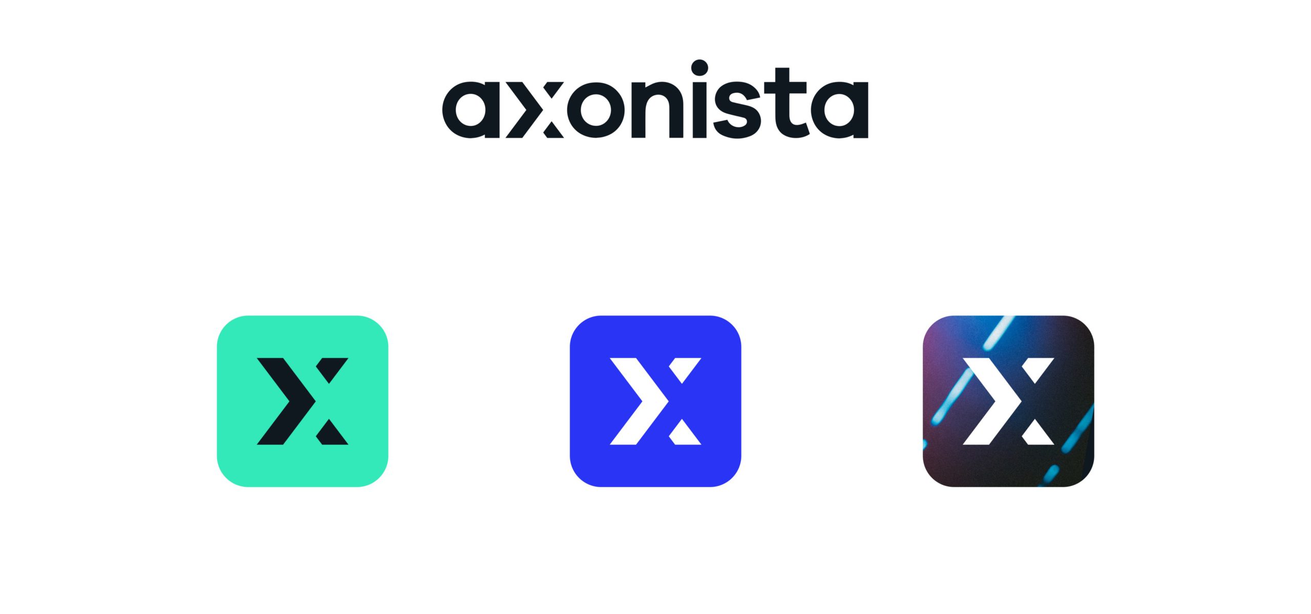
The colors, typography, mark and logotype combine to create a bold, unique, and recognizable brand. A simple identity that can stand the test of time.
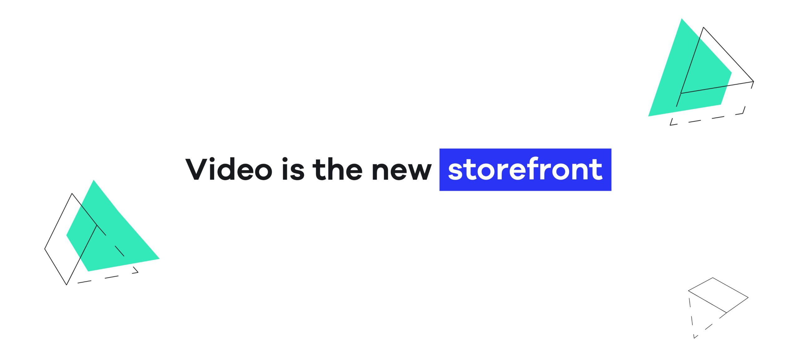
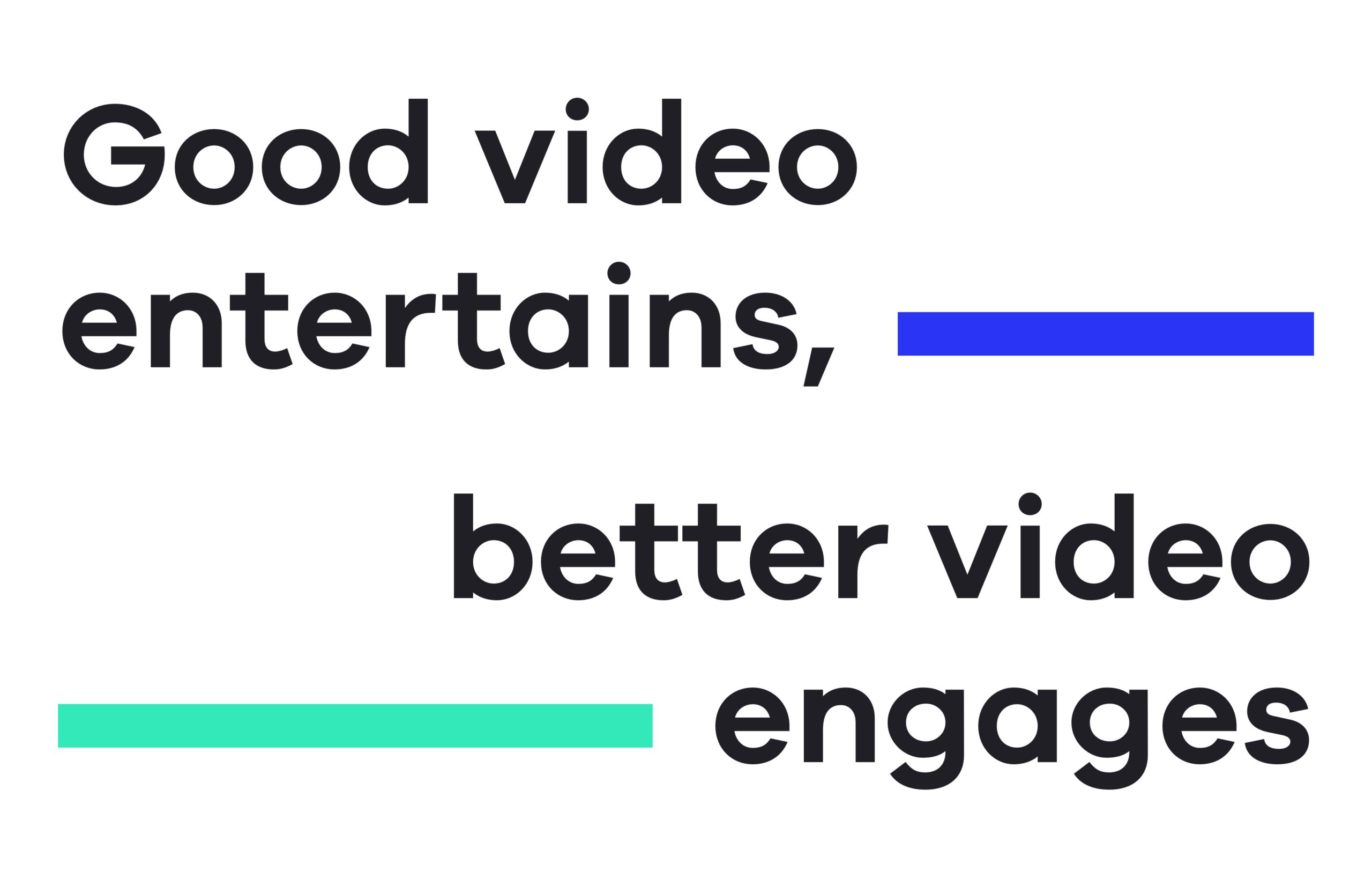
The blue and turquoise are youthful, vibrant, and energetic colors — creating a certain tension when used together. The typography is what you might expect from a tech company, but this one is particularly friendly and approachable.
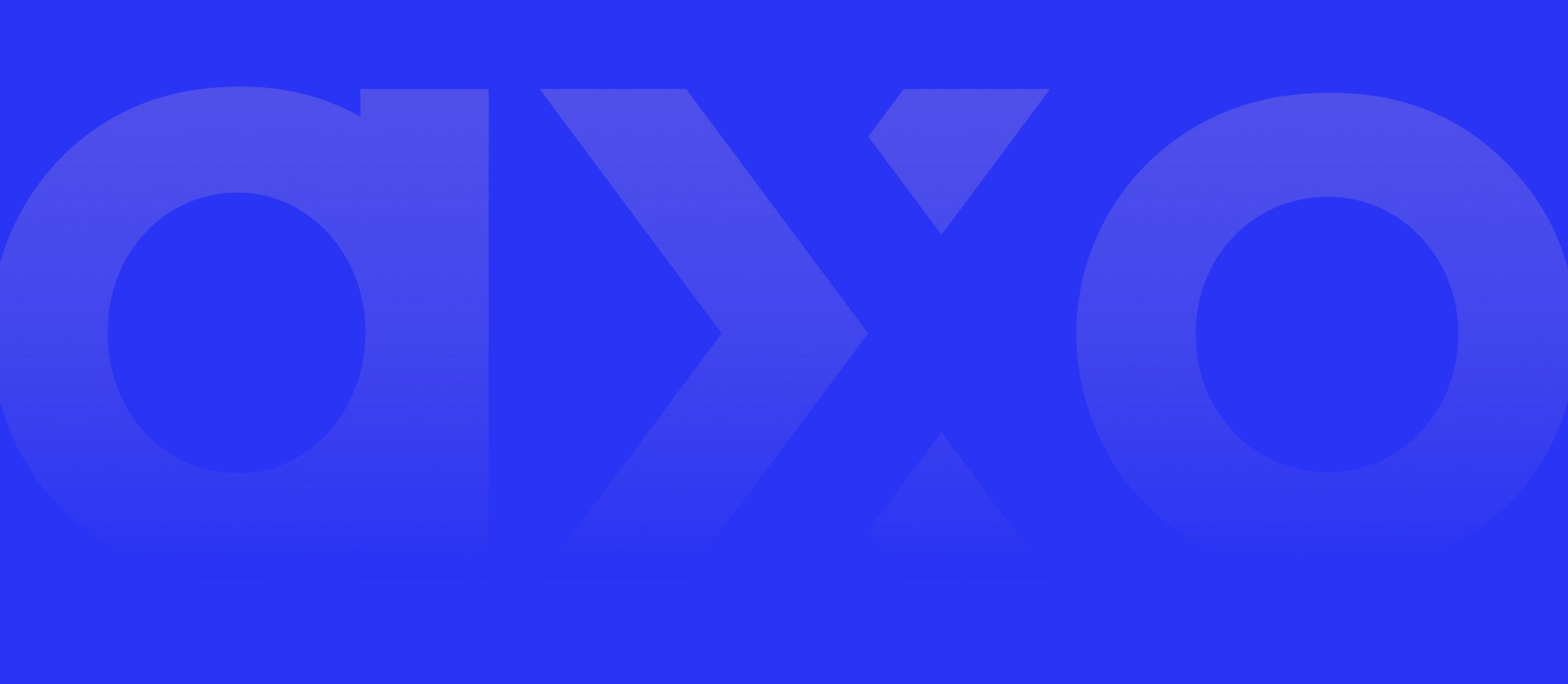
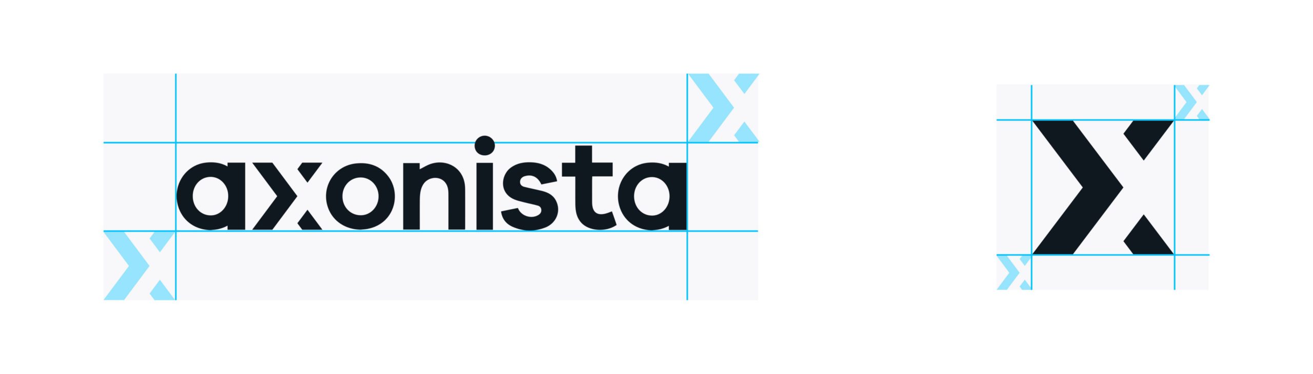
Our logotype is based on the same font — but it has a few custom characteristics. Most notable is the “X”, which is primarily constructed using an arrow shape — a reference to iconography contained inside video player UI, such as the play, fast forward, and skip buttons. And in an abstract sense, the forward facing arrow can represent progress, vision, and consideration for the future.
Retiring a brand
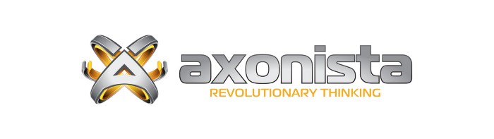
The outgoing Axonista brand has served us well for nine years, seeing many trends, fads, and technologies come and go. It is much loved and has endured as a steadfast emblem of our lasting vision for the future of video and TV.
An in-depth critique and re-evaluation led us to the conclusion that the aesthetic and form is no longer the best way to represent our values. It is beginning to feel dated, and doesn’t sit well in the new era of flat design, so we decided it was time for something new.
Approach
Creating a new brand from scratch was always on the table, but we didn’t want to give up on our old logo just yet. It has legacy, and means a lot to the people that have worked at Axonista from the start — as well as to the customers with whom we’ve built up trust over the years.
We started by looking at how we might refresh the brand, so we took aim at the logo mark. That exercise, to reduce the complexity of the old mark while retaining its form, went like this…
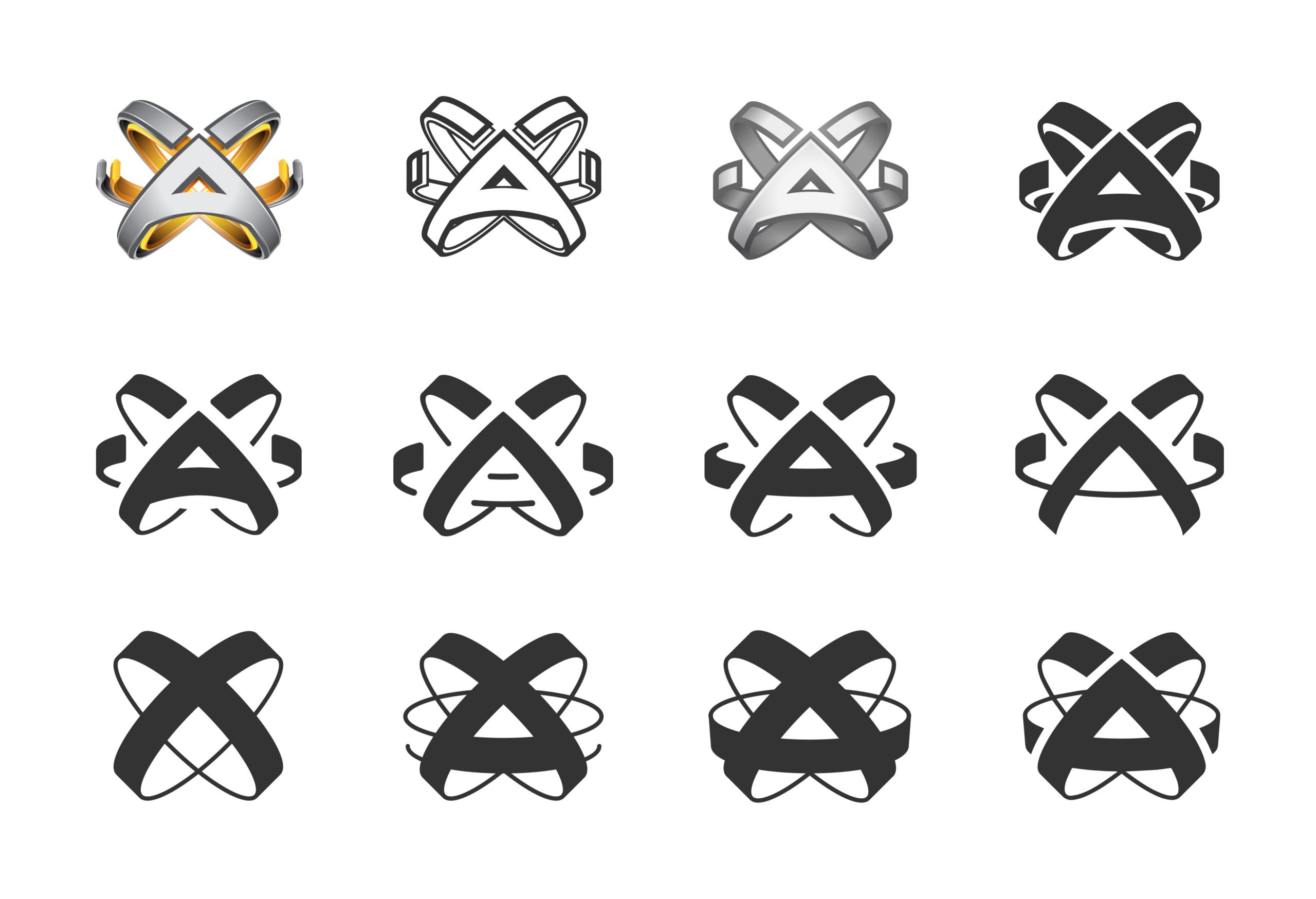 We brought this concept through dozens of iterations to where we felt was its natural conclusion, but in the end, we were not entirely satisfied by it. We had a flat logo mark, but due to the innate level of complexity, it didn’t work well at smaller sizes, which is a dealbreaker for a modern logo.
We decided to move on, and directed our efforts to create something new. A brand that’s simple, but recognisable. Luckily for us, we had a lot of symbology to draw from, being an interactive video company and all ⏸⏏⏮⏪⏩⏭🤩🥳.
Here’s a glimpse at some alternatives we created…
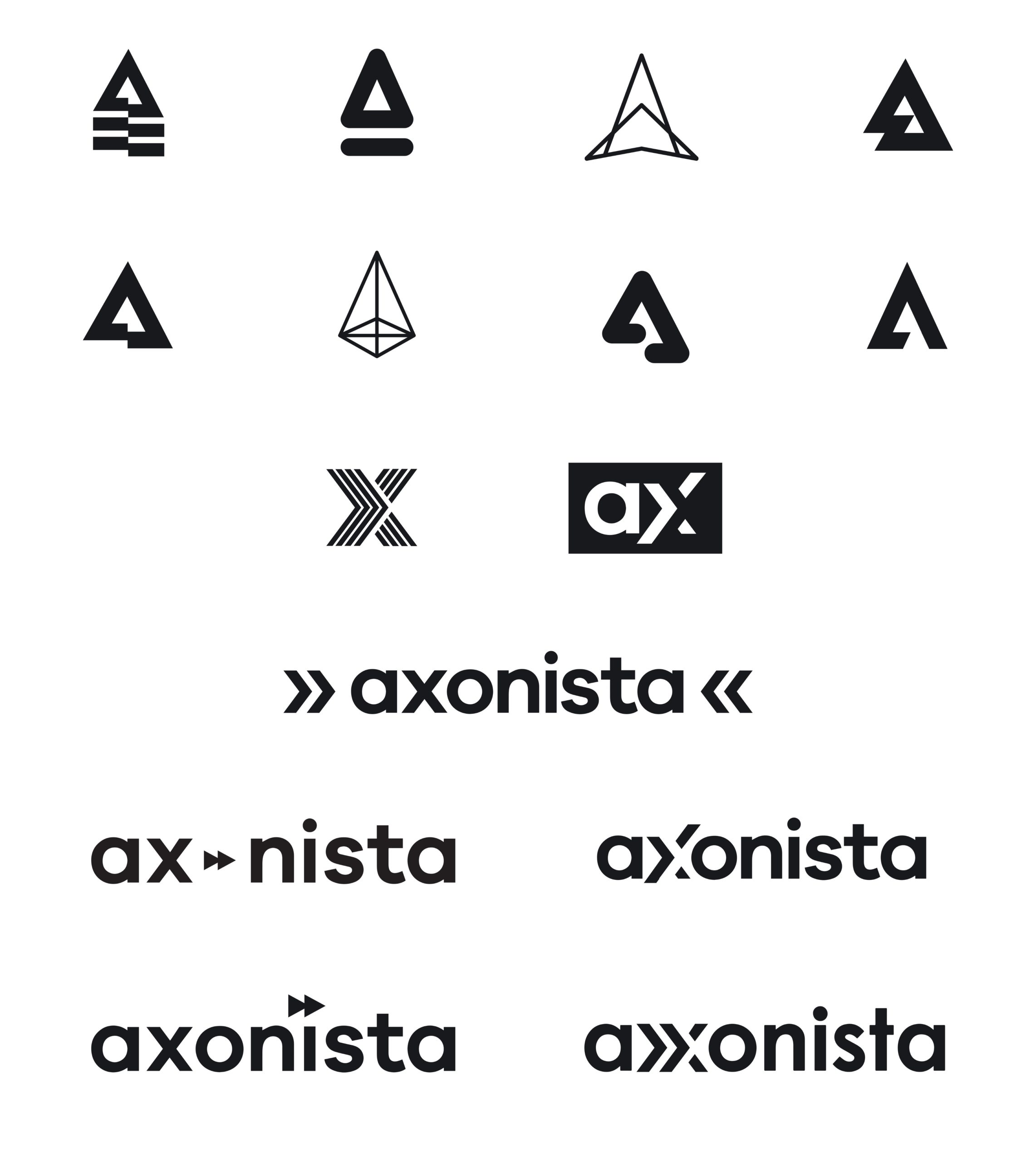
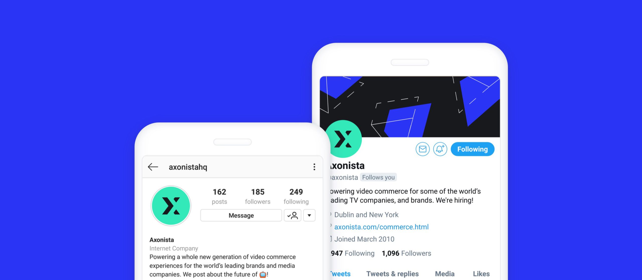
We quickly realised that creating an icon from a letter and containing it within the type gave us a lot of flexibility. For an eight-character name, it’s condensed enough to fit comfortably in most spaces. And when it doesn’t, we use the “X” as an icon mark.
Arriving at this simple shape was the linchpin to create a more recognizable, and cohesive identity. It gave us the freedom to experiment with many different visual styles. Now we’ve found one that our team can all rally around. One that better represents our culture and provides us the means for more expressive communication.
Our new identity is a vessel for everything we have to say — and we have a lot to say about the future of video and TV as Axonista’s journey continues.
Follow our story on Facebook, Twitter, Instagram, and LinkedIn. Get in touch with us at hello@axonista.com.
If you’d like to come and work with us — we’re hiring, take a look at our open positions.